Optimizing E-Commerce Accessibility & Authentication for High-Conversion Checkouts
OMRON Healthcare | Authentication Redesign
1. Executive Summary
The Product: OMRON Medical Devices E-Commerce Platform. The Challenge: A highly complex user journey plagued by hidden navigation links and a rigid, high-friction user onboarding process that blocked users from completing purchases smoothly. The Solution: Overhauled the platform's accessibility, made the primary purchase pathways completely transparent, and introduced instant multi-channel authentication (Google, Mobile OTP, and Email). The Results: Eliminated the drop-offs caused by forced account creation, simplified the end-to-end user journey, and created a frictionless, "sweet checkout" experience that allowed users to buy with total ease.
2. The Problem & Context (The "Before")
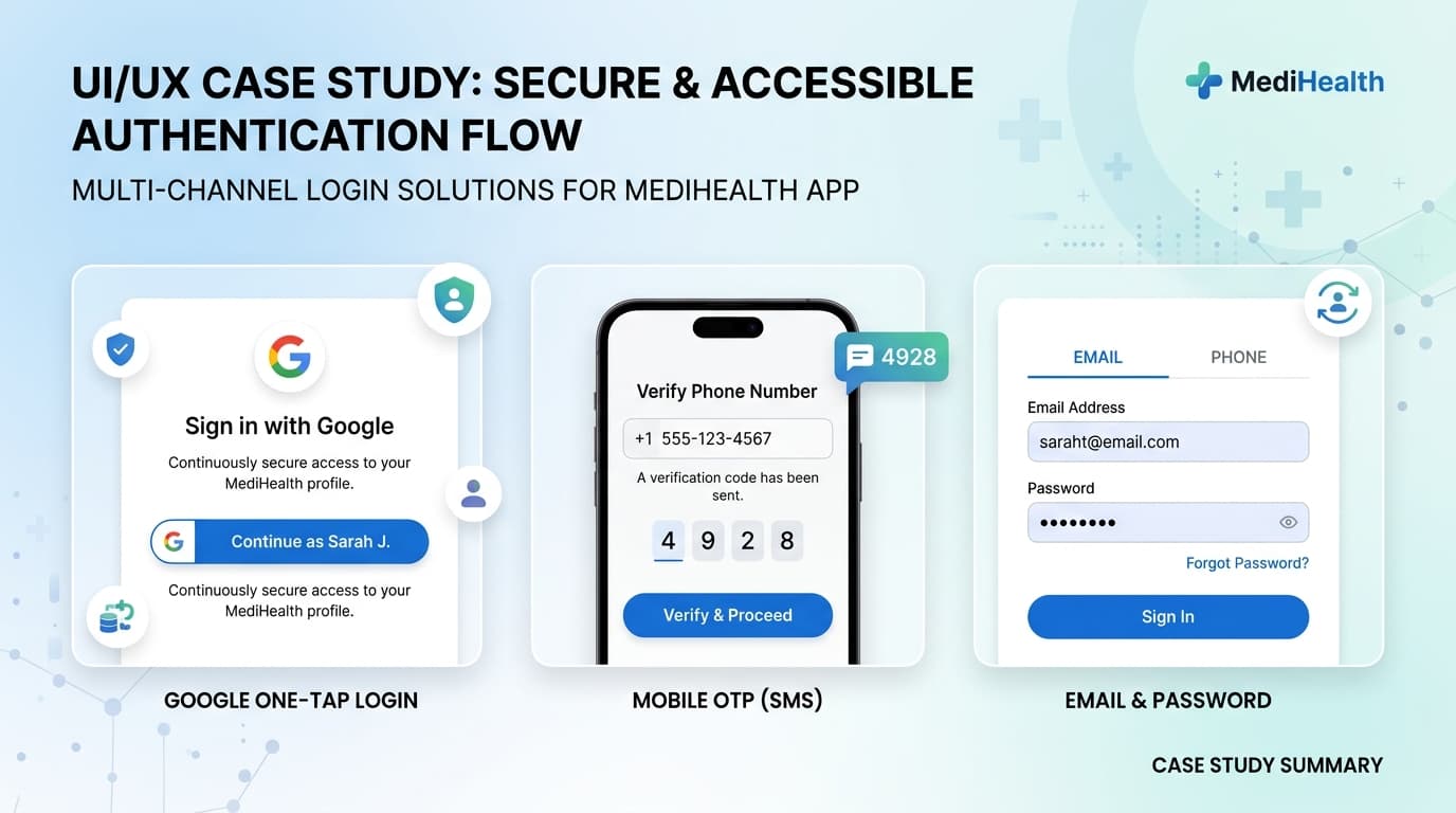
During a deep dive into the original interface, we uncovered significant usability blockers that heavily restricted the platform's performance: • Hidden Links & Information Architecture Flaws: Critical elements of the primary user journey—including essential navigation links—were visually obscured or buried. This forced users through a complex, frustrating maze just to find what they needed. • High-Friction Account Creation: Before a user could even reach the checkout screen, they were met with a mandatory, tedious profile registration loop, acting as a massive roadblock to immediate purchasing.
3. The Design Strategy & Solution
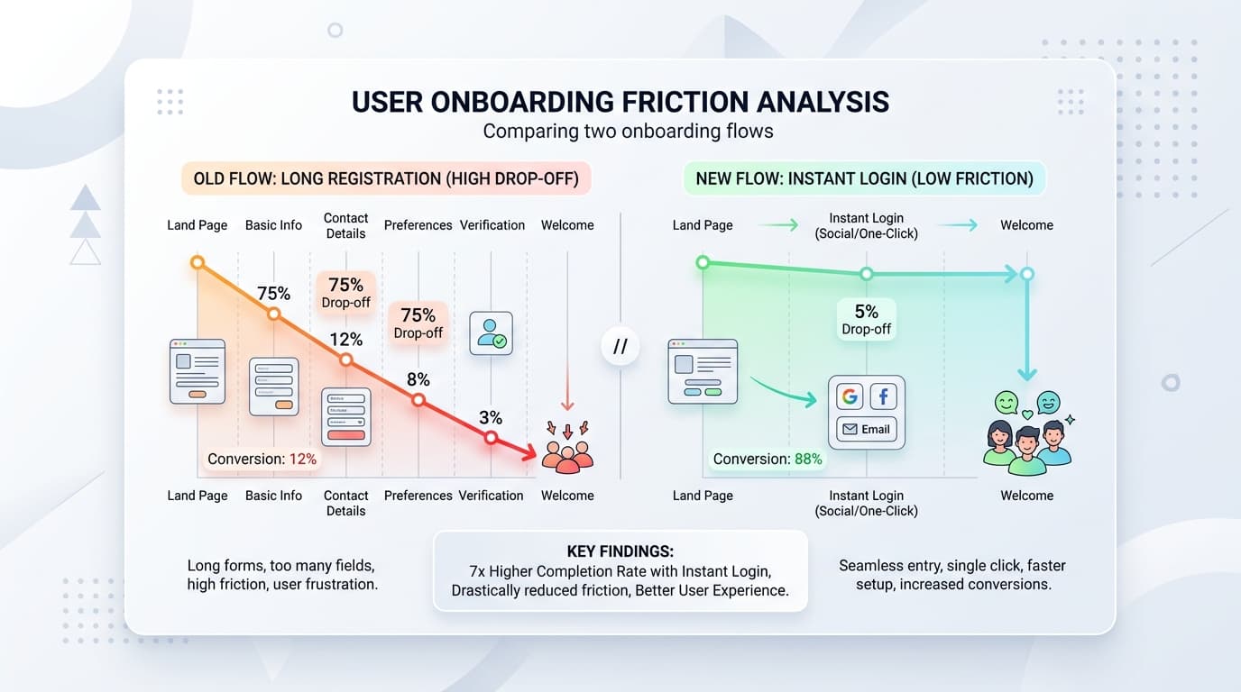
The goal of this redesign was simple: shed unnecessary steps, bring hidden pathways to the forefront, and ensure the entire process felt effortless. Frictionless Multi-Channel Identity Management To solve the onboarding bottleneck, we introduced a flexible, one-click authentication system at the top of the funnel. Instead of filling out traditional, long forms, users could choose their preferred method: • Instant Google Login: For rapid desktop and mobile entry. • Mobile Phone Number (OTP) Login: Highly optimized for regional users who prefer phone-first authentication. • Traditional Email Login: Preserved for users who prefer standard credentials. Uncovering the Journey (Accessibility Overhaul) We redesigned the information architecture to ensure that the primary user journey was clean, highly visible, and required minimal cognitive load. Hidden links were brought directly into the main viewport, providing a predictable and straight path from product page to cart. The "Sweet Checkout" Paradigm By pairing accessible navigation with seamless social/mobile login options, we built what we termed a "Sweet Checkout" experience. The entire checkout funnel was streamlined into a clean, minimal UI that ensured users encountered zero distractions or layout confusion right as they were trying to finalize their purchase.
4. The Impact (The "After")
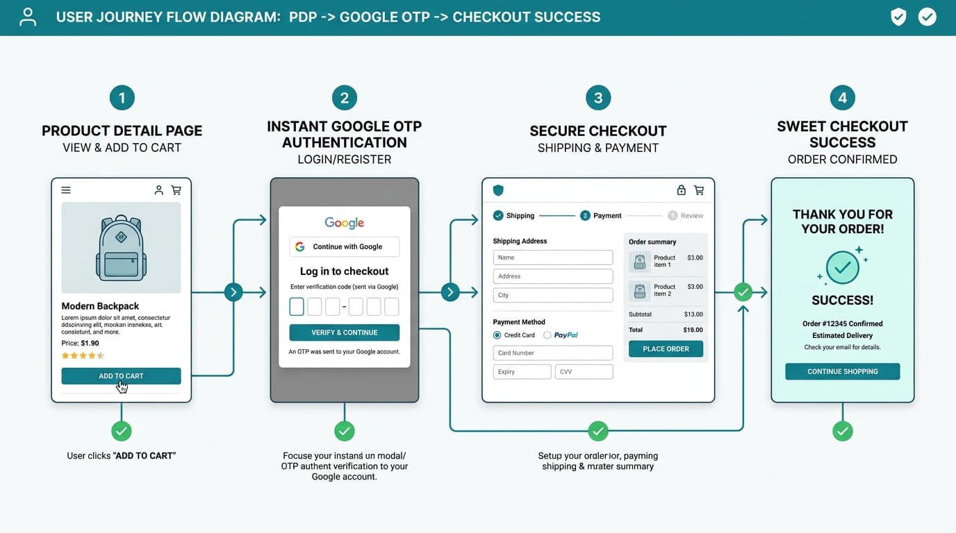
• Drastic Drop in Checkout Friction: Implementing quick-auth options significantly reduced the time-to-onboard and eliminated form-fatigue drop-offs. • Cleaner, More Intuitive Flow: Moving hidden links into standard, highly visible UI patterns created an entirely transparent purchase path where users could checkout with ease. • Elevated User Satisfaction: By focusing on accessibility, the interface felt modern, trustworthy, and incredibly respectful of the user's time.
5. Key Takeaways & Lessons Learned
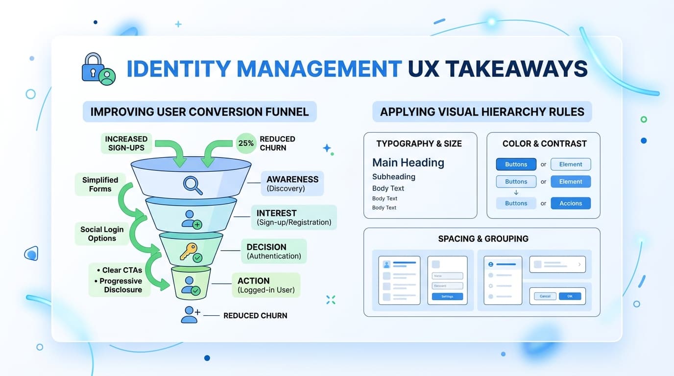
Identity Management IS User Experience: Forcing a manual, complex profile setup before a purchase is a conversion killer. Integrating instant authentication tools like Google and Mobile OTP is one of the highest-leverage UX improvements an e-commerce platform can make. Never Hide Core Utilities: If a link or navigation option is critical to the user journey, it must be highly visible. Clear visual hierarchy beats beautiful but hidden UI elements every single time.