₹1 Lakh in a Single Day vs. One Month
OMRON Healthcare | India
1. Executive Summary
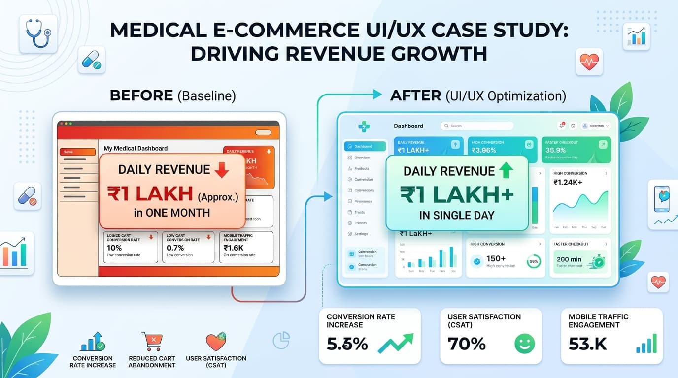
The Product: OMRON Medical Devices E-Commerce Platform. The Challenge: A complex, fragmented user journey with hidden navigation links made online purchasing frustrating, capping monthly revenue at roughly ₹1 Lakh. The Solution: Overhauled the end-to-end checkout experience, introduced quick-commerce checkout milestones, and streamlined user onboarding with simplified authentication. The Results: Generated ₹1 Lakh in sales in a single day (matching a previous month's worth of revenue) and entirely cleared out product stock by day two of launch.
2. The Problem & Context (The "Before")
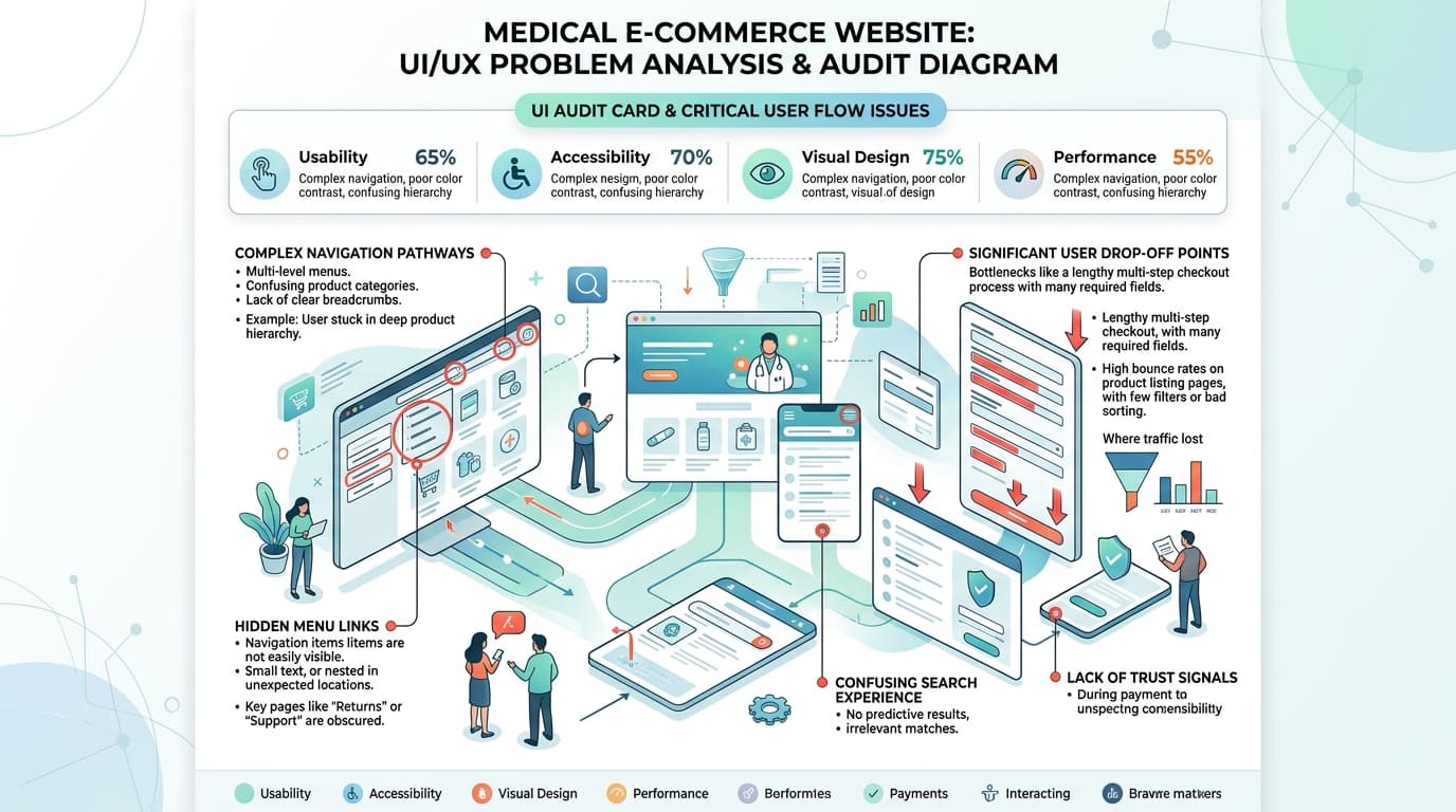
OMRON is a household name in medical devices, yet the digital shopping experience didn't reflect the brand's reliability. The baseline metrics highlighted serious conversion friction: Complex Navigation & Hidden Links: Critical paths to find and purchase products were buried under an unintuitive information architecture, leaving users confused during the discovery phase. High Checkout Friction: Forcing users into long, multi-step profile creation loops caused high cart abandonment rates. Revenue Ceiling: Due to these user experience gaps, online sales were sluggish, averaging just ₹1 Lakh per month.
3. The Design Strategy & Solution
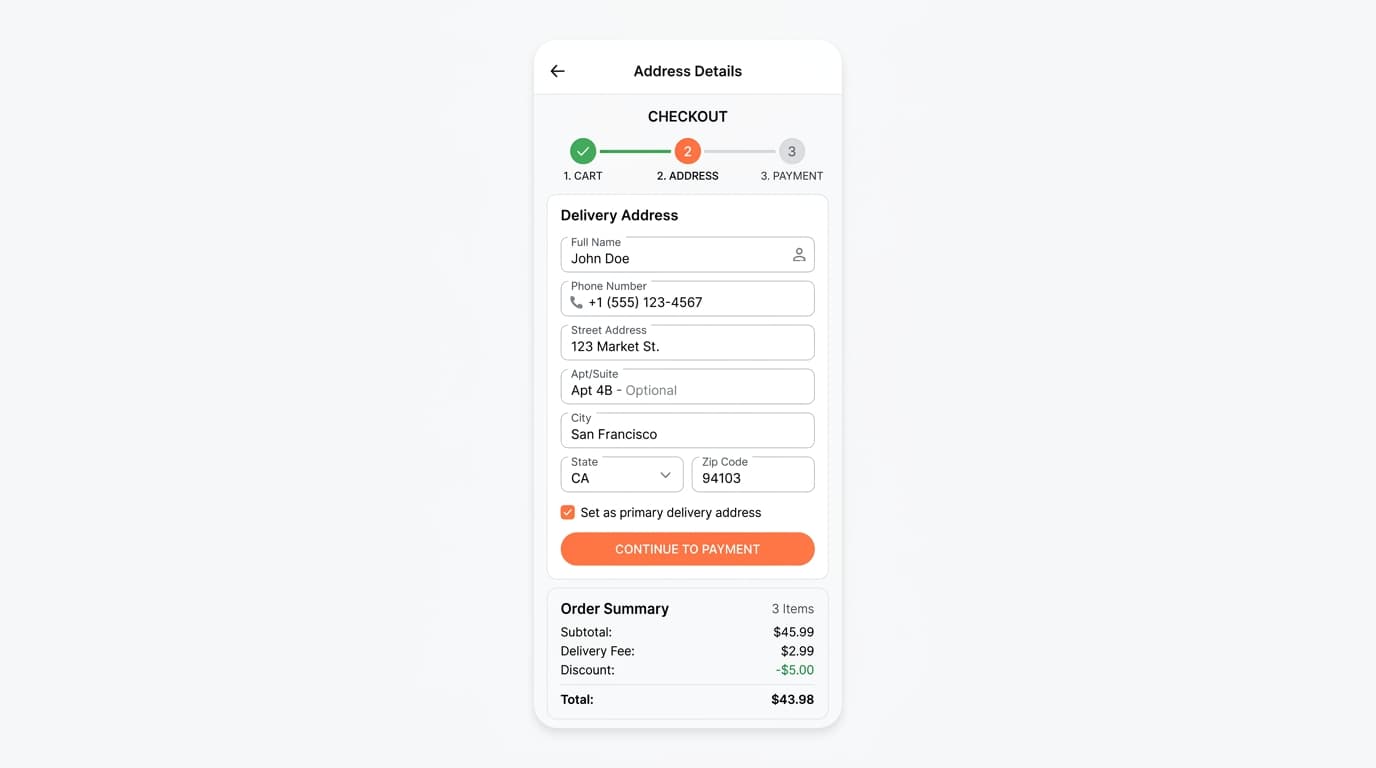
To fix the leaky conversion funnel, the redesign focused on accessibility, speed, and modern checkout UX paradigms. Streamlined Social & Mobile Onboarding We completely bypassed long registration forms. By introducing quick-auth options via Google Login, Email, and Mobile OTP, users could create an account and authenticate instantly, smoothing the very top of the purchasing funnel. The "Sweet Checkout" Experience We transformed the checkout phase into a highly transparent, clear, and efficient flow: Quick-Commerce Milestones: Borrowing successful UX patterns from the quick-commerce space, we introduced a clear milestone indicator (e.g., Cart -> Address -> Payment). This managed user expectations and created a psychological sense of forward momentum. Form Optimization: Stripped away unnecessary input fields, replacing them with a highly accessible, single-column address and checkout layout to reduce cognitive load.
4. The Business Impact (The "After")
The redesign was launched to immediate, unprecedented commercial success: • Sales Velocity: ₹1,00,000 / single day (Up from ₹1,00,000 / month) • Inventory Status: 100% Out of Stock by Day 2 (Up from Slow-moving stock) • Onboarding Friction: Low (Instant Google/Mobile Login) • Checkout Usability: Clean, accessible "Sweet Checkout"
5. Key Takeaways & Lessons Learned
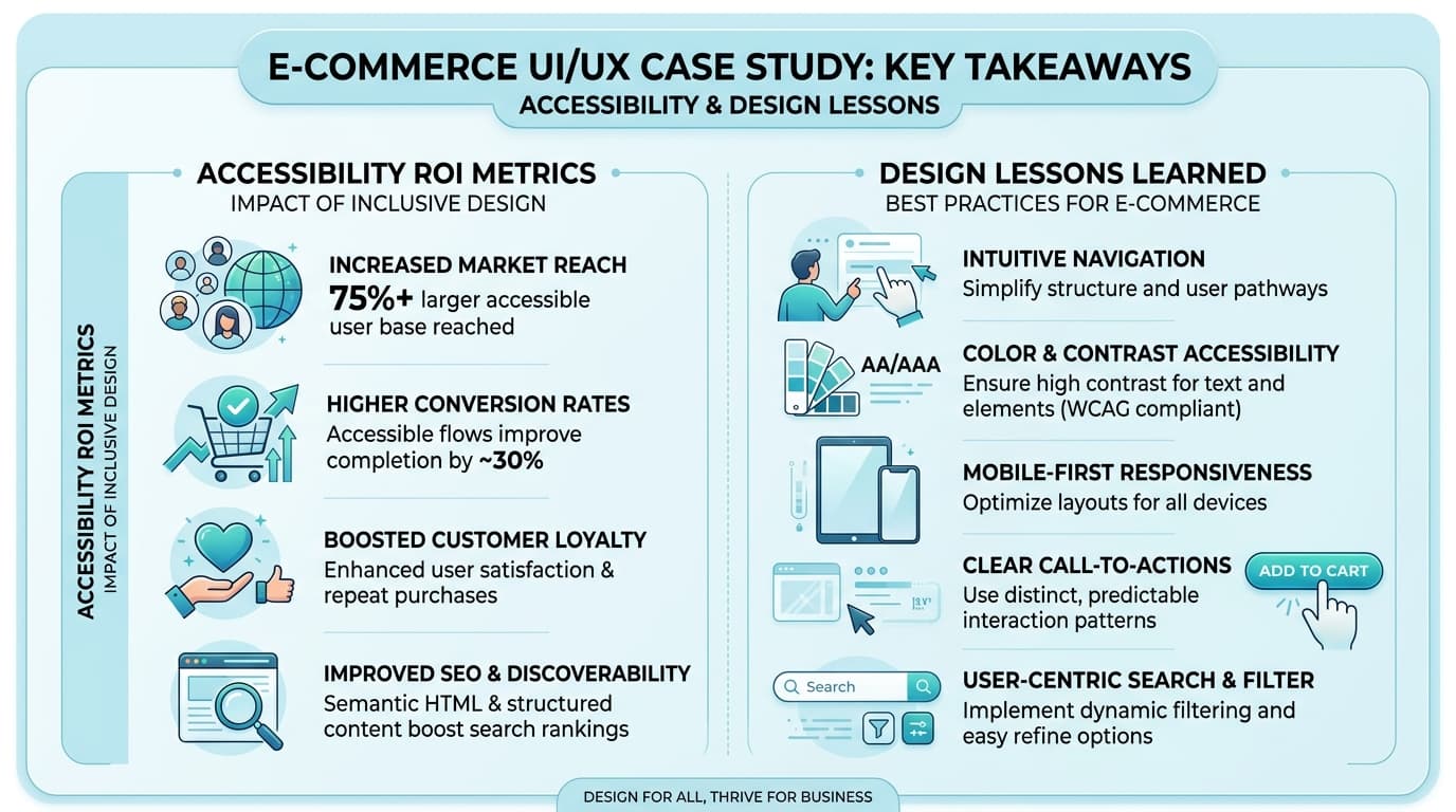
Borrow Proven Paradigms: Integrating quick-commerce milestones into traditional e-commerce works because users are already trained on those patterns. It reduces the learning curve instantly. Accessibility directly impacts ROI: When you fix hidden links and clarify the user journey, you don't just improve usability scores—you unlock massive, immediate business revenue.